AmbiguityVis: Visualization of Ambiguity in Graph Layouts
Yong Wang, Qiaomu Shen, Daniel Archambault, Zhiguang Zhou, Min Zhu, Sixiao Yang, Huamin Qu
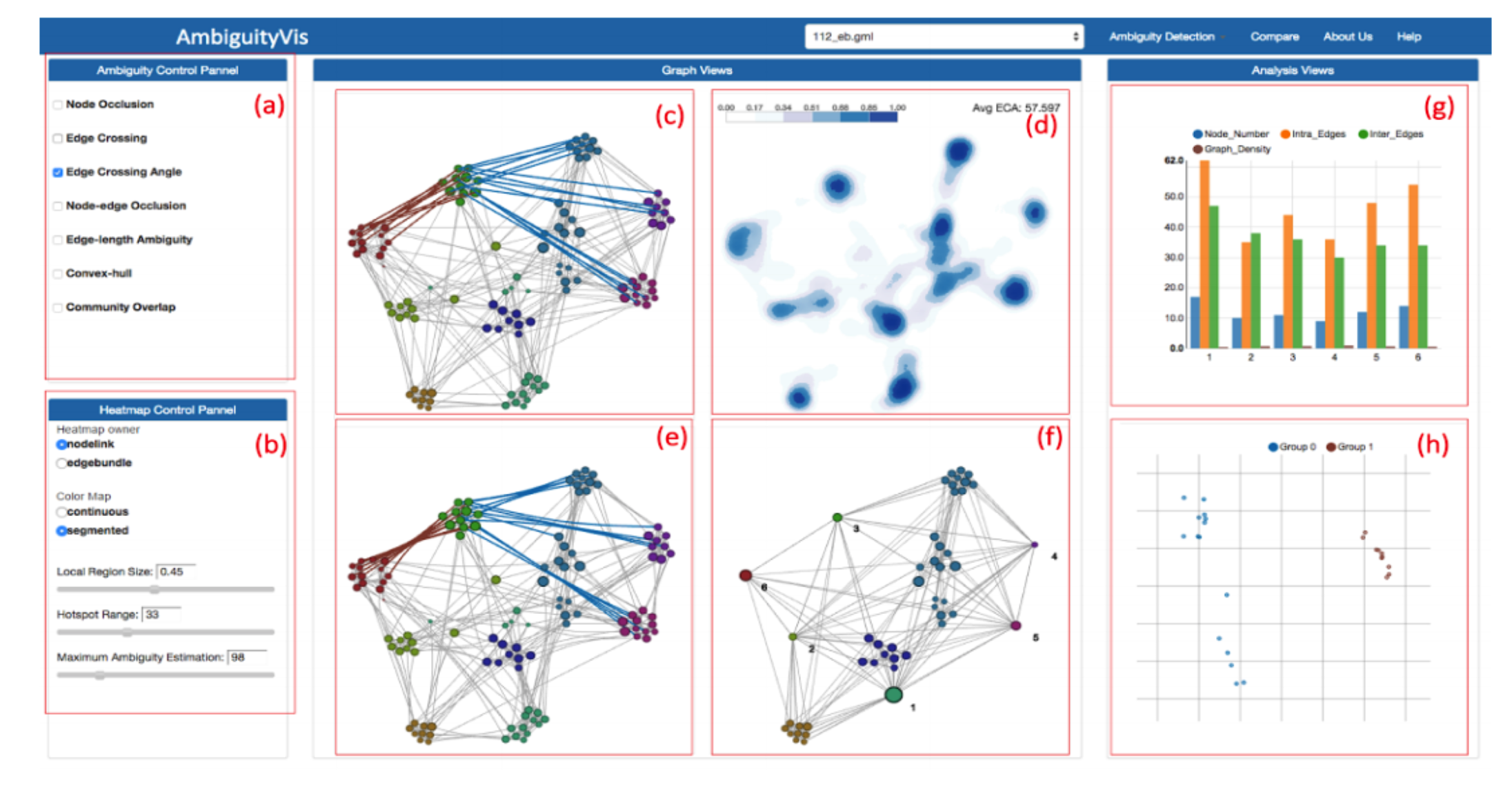
User interface of AmbiguityVis showing the ambiguities existing in graph layouts. It consists of eight parts: (a) Ambiguity control panel allowing users to select the type of detected ambiguity. (b) Heatmap control panel enabling users to adapt the parameters of the heatmap such as hotspot range and local region size used in entropy and autocorrelation. (c) The node-link diagram layout. (d) Heatmap view for the selected type of ambiguity in the graph layout. (e) Edge bundling view. (f) Node aggregation view. (g) Bar chart view used to inform users of the underlying information in each metanode. (h) Scatterplot view generated by MDS to show the consistency of the bundled edges.
Description
Node-link diagrams provide an intuitive way to explore networks and have inspired a large number of automated graph layout strategies that optimize aesthetic criteria. However, any particular drawing approach cannot fully satisfy all these criteria simultaneously, producing drawings with visual ambiguities that can impede the understanding of network structure. To bring attention to these potentially problematic areas present in the drawing, this paper presents a technique that highlights common types of visual ambiguities: ambiguous spatial relationships between nodes and edges, visual overlap between community structures, and ambiguity in edge bundling and metanodes. Metrics, including newly proposed metrics for abnormal edge lengths, visual overlap in community structures and node/edge aggregation, are proposed to quantify areas of ambiguity in the drawing. These metrics and others are then displayed using a heatmap-based visualization that provides visual feedback to developers of graph drawing and visualization approaches, allowing them to quickly identify misleading areas. The novel metrics and the heatmap-based visualization allow a user to explore ambiguities in graph layouts from multiple perspectives in order to make reasonable graph layout choices. The effectiveness of the technique is demonstrated through case studies and expert reviews.
Materials
Videos
About
VisNexus is a series of visualization projects aiming to improve our understanding of the complex relations among data entities, which is conducted by the VisLab at Hong Kong University of Science and Technology. The HKUST VisLab is a multidisciplinary group aiming at improving the visual analysis and various visualizations.
Topics
The projects are categorized into following five topics:
Contact
Yanhong Wu: yanhong.wu@ust.hk
Yong Wang: ywangct@ust.hk
Qiaomu Shen: shenqiaomu@ust.hk
Address: Department of Computer Science and Engineering, Hong Kong University of Science and Technology, Clear Water Bay, Kowloon, Hong Kong